
Ready to get your next 10,000 subscribers?
Join thousands of creators who use Subscribr to create faster, better YouTube videos.

YouTube Thumbnails: Best Practices to Get More Clicks (Examples Included)
Your YouTube thumbnail is often the very first thing a potential viewer sees. In a crowded feed of videos, your thumbnail has just a split second to grab attention and convince someone to click. It's your video's storefront window, and if it doesn't look appealing, people will just keep scrolling.
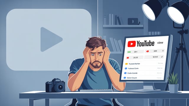
Many creators struggle with getting their videos discovered, and a major culprit is often a low click-through rate (CTR). While a compelling title and description are important (part of your overall On-Video Optimization), a powerful thumbnail can make or break your video's performance.
So, what makes a good YouTube thumbnail, and how do you make yours stand out? Let's dive into the best practices that can help you boost your CTR and get more eyes on your content.
What Makes a Good YouTube Thumbnail?
A successful thumbnail isn't just a random image; it's a carefully designed piece of marketing that communicates value and sparks curiosity. Based on insights from top YouTube strategists, effective thumbnails share several key characteristics:
Simplicity and Focus
In a tiny format, clutter is the enemy. A good thumbnail is easy to understand within a second or two. It should center on one primary thing – the core idea or promise of your video. Avoid packing too much information or too many elements into the small space.
Size and Readability
Even though viewers see thumbnails in various sizes, they are often quite small, especially on mobile. This means everything in your thumbnail needs to be big and take up most of the available space. Minimize blank space unless it's intentionally used to highlight an object or text. Any text you include must be minimal, large, and easy to read. High contrast between the text and background is essential, or consider adding a border around the text for better readability.
Minimal Elements
Top-performing thumbnails often use three or fewer primary elements. This could be a person, a background, and a piece of text. Limiting your elements helps maintain simplicity and focus, preventing the thumbnail from looking messy and overwhelming.
Color and Contrast
Strategic use of color can make your thumbnail pop in a busy feed. Feel free to use bright colors that grab attention, but ensure they align with your brand. More importantly, use contrasting colors to make key elements, especially text, stand out against the background.
Key Elements of a High-Performing Thumbnail
Beyond the basic design principles, certain elements consistently appear in thumbnails that achieve high CTRs:
Include a Face
Humans are naturally drawn to faces. Including a clear, expressive face in your thumbnail can make it more relatable and attention-grabbing. Whether it's your own face showing a strong emotion related to the video's topic or the face of someone featured, a face helps the thumbnail stand out. Businesses or channels associated with a face often build a stronger connection with their audience.
Illustrate the "Dream Outcome"
Your thumbnail should visually represent the benefit or result a viewer will get from watching your video. If your video is a tutorial, show the finished product. If it's about achieving a goal, show the desired state. This visual promise helps viewers instantly understand the value proposition of your content.
Create a Curiosity Gap
While illustrating the outcome is important, adding a touch of mystery can also drive clicks. Use imagery or text that hints at a secret, an unexpected result, or a question the viewer will want answered by watching the video. The thumbnail and title should work together here, with the thumbnail often adding a visual twist or curiosity element that complements the title's promise.
Designing Your Thumbnail for Maximum Impact
Designing for the small screen requires specific considerations:
Think Mobile First
While thumbnails appear on desktops, TVs, and other devices, a huge percentage of YouTube watch time is on mobile. Design your thumbnail so it's impactful and readable even when displayed very small on a phone screen.
High Resolution is a Must
Use a high-resolution image for your thumbnail. YouTube recommends a resolution of 1280x720 pixels, with a minimum width of 640 pixels. A clear, crisp image looks professional and is easier to interpret.
Consistency Builds Brand
Develop a consistent style for your thumbnails. This includes color schemes, font usage, and layout. A recognizable thumbnail style helps viewers quickly identify your content in their feed, building brand recognition and loyalty.
The Power of Thumbnail and Title Synergy
Your thumbnail doesn't work in isolation. It's part of a dynamic duo with your video title. The thumbnail grabs attention visually, while the title provides context and reinforces the promise.
Think of them as a mini-story. The thumbnail presents a compelling visual, and the title adds crucial information or frames the visual in a captivating way. They should complement each other and create a clear, enticing message that makes viewers want to click and learn more.
Testing and Iteration: The Key to Improvement
Even with the best design principles, you won't know what truly resonates with your audience until you test it. YouTube provides built-in tools like A/B testing (Thumbnail Test) that allow you to test multiple thumbnail designs for the same video simultaneously. This is the most reliable way to see which design performs best in terms of CTR.
Furthermore, constantly analyze successful videos in your niche. Search for your video's topic and filter by 'Most viewed' to see what thumbnails are already working. Don't copy, but use them as inspiration to understand the visual language and common elements that attract clicks within your specific content category.
Tools & Resources for Thumbnail Creation
Creating compelling thumbnails doesn't require advanced design degrees. Several user-friendly tools can help:
- Canva: A popular online design tool with templates specifically for YouTube thumbnails. Easy drag-and-drop interface.
- Adobe Express (formerly Adobe Spark): Another accessible online design platform with templates and easy-to-use editing tools.
- GIMP / Adobe Photoshop: More powerful image editing software for advanced users who want complete control over their designs.
For analyzing what makes thumbnails work and integrating thumbnail strategy into your overall content plan, platforms like Subscribr can provide valuable insights. Subscribr's tools can help you analyze successful content patterns, including thumbnail styles, within your niche and plan your videos with a strong visual strategy from the start. By analyzing top-performing videos, you can identify visual trends and integrate them into your own thumbnail design process.
Many online courses and tutorials are also available that go deeper into graphic design principles specifically for YouTube creators. Investing in learning these skills can significantly impact your channel's growth.
Conclusion
Your YouTube thumbnail is a critical component of your video's success. By focusing on simplicity, clarity, strong visuals, and creating synergy with your title, you can significantly increase your click-through rate. Remember to test different designs and draw inspiration from successful channels in your niche. Prioritizing your thumbnail design is one of the most impactful steps you can take to get your videos discovered and grow your channel. Start experimenting today and watch your clicks climb!