
Ready to get your next 10,000 subscribers?
Join thousands of creators who use Subscribr to create faster, better YouTube videos.

You pour hours into scripting, filming, and editing your YouTube videos. But when you hit publish, does something still feel… off? Maybe the colors look flat, inconsistent, or just plain unprofessional compared to your favorite creators. If you're struggling to achieve that polished, cinematic look, you're not alone. Difficulty in achieving consistent, professional-level video quality is a major hurdle for many intermediate YouTubers.
The good news? You don't need a Hollywood budget or years of film school to make your videos look stunning. The secret lies in mastering two powerful post-production techniques: color correction and color grading. While the editing process is often perceived as tedious and complex, breaking down color work into manageable steps can transform your footage and elevate your channel's perceived quality.
This guide will walk you through the fundamentals of YouTube video color grading and correction, helping you overcome the technical learning curve and achieve a consistent, professional aesthetic that captivates your audience.
Color Correction vs. Color Grading: What's the Difference?
Before we dive deep, let's clarify the two main stages of color work:
- Color Correction: This is the essential first step. Color correction is about making your footage look natural and accurate. It involves adjusting white balance, exposure, contrast, and saturation to ensure that colors are true-to-life and consistent across all your clips. Think of it as fixing any technical issues with the color captured by your camera. The goal is a neutral, balanced image.
- Color Grading: This is the creative step. Once your footage is corrected, color grading is where you apply a specific look or style to evoke a mood, enhance storytelling, or establish your brand's visual identity. This could be a warm, nostalgic feel, a cool, cinematic look, or a vibrant, energetic style. Color grading is about artistic interpretation and creating a cohesive visual language for your channel.
You MUST correct before you grade. Trying to apply a creative look to footage that has incorrect white balance or exposure will lead to frustrating and poor results.
Why Color Matters for Your YouTube Channel
In the competitive landscape of YouTube, video quality plays a significant role in viewer perception and retention. While content quality and value are paramount (as emphasized by YouTube strategists, good content always trumps poor content), the visual presentation, or "wrapper," significantly impacts how viewers feel about your content and your brand.
Think Media Podcast highlights that while production value isn't the primary driver of growth, improving the quality of your videos, including the visual experience, can lead to "hero" or "breakout" videos. Color grading and correction are fundamental aspects of this improved quality.
Here's why mastering color is crucial for your YouTube success:
- Professionalism: Consistent and polished color makes your videos look higher quality and more professional, building trust with your audience.
- Branding: A unique color grade can become part of your channel's visual identity, making your videos instantly recognizable.
- Storytelling & Mood: Color evokes emotion. A warm grade can feel inviting, while a cool tone might feel dramatic. Using color intentionally enhances the mood and narrative of your video.
- Viewer Retention: Visually appealing videos are more engaging. Fixing distracting color issues and applying a pleasing grade can keep viewers watching longer.
- Standing Out: In many niches, creators neglect color work. Mastering it can give you a distinct visual edge.
Channels that teach video editing, which inherently includes color work, often showcase dramatic before-and-after comparisons in their thumbnails. Channels like @premierebasics and @saikat_samanta demonstrate the power of post-production to transform footage.
Fundamentals of Video Color
To effectively correct and grade, a basic understanding of color principles in video is helpful:
- White Balance: This tells your camera what "white" should look like under different lighting conditions. Getting it right in-camera or correcting it in editing is essential for accurate colors.
- Exposure: How bright or dark your image is. Proper exposure is crucial for retaining detail in highlights and shadows.
- Contrast: The difference between the brightest and darkest parts of your image. High contrast has deep shadows and bright highlights; low contrast appears flatter.
- Saturation: The intensity or purity of colors. High saturation means vivid colors; low saturation means muted or desaturated colors.
- Hue: The actual color itself (red, blue, green, etc.).
- Luminance (or Luma): The brightness of the image, independent of color. Often represented on a waveform scope.
- Chrominance (or Chroma): The color information, independent of brightness. Often represented on vectorscope and parade scopes.
- Scopes: Video editing software has tools (waveforms, vectorscopes, RGB parades) that graphically represent the color and brightness information in your footage. Learning to read these is key for objective color correction, ensuring you don't rely solely on your potentially uncalibrated monitor.
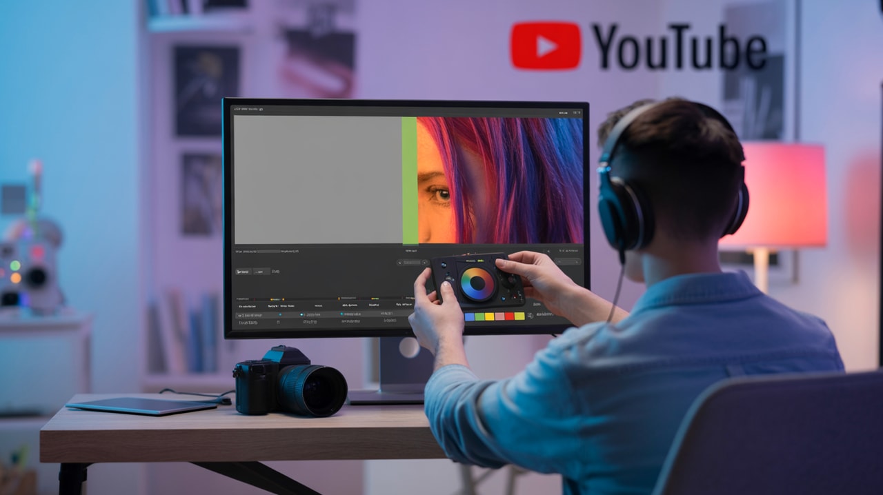
The Color Grading Workflow: A Step-by-Step Approach
Approaching color work with a clear workflow can make the process less daunting and more efficient.
Step 1: Organize Your Footage and Project
Start with a well-organized project file in your video editing software (like Adobe Premiere Pro, DaVinci Resolve, Final Cut Pro, or CapCut). Ensure all your clips are imported and your edit is locked (no more cuts or moves!).
Step 2: Primary Color Correction
This is where you fix the technical issues. Apply adjustments that affect the entire image globally.
- White Balance: Correct any color casts so that whites look white and colors look natural. Use a white balance eyedropper tool if your software has one, or manually adjust temperature and tint.
- Exposure: Adjust the overall brightness. Use your waveform scope to ensure you're not clipping highlights (losing detail in bright areas) or crushing shadows (losing detail in dark areas).
- Contrast: Set your black and white points. Use the waveform or RGB parade scopes to make sure your blacks are black (but not crushed pure black) and your whites are white (but not blown-out pure white).
- Saturation: Adjust the overall intensity of colors. Aim for a natural look. Avoid over-saturating, which can make footage look artificial.
The goal of primary correction is a clean, neutral image that provides a solid foundation for creative grading.
Step 3: Secondary Color Correction (Targeted Adjustments)
Sometimes you need to adjust specific colors or areas of the image.
- Skin Tones: This is often the most critical secondary adjustment. Skin tones should look natural and healthy, regardless of the overall look you're going for. Use the vectorscope to check if skin tones are falling correctly on the designated skin tone line.
- Specific Hues: You might want to adjust the color of a particular object (like making a red shirt pop) or make foliage a specific shade of green. Use HSL (Hue, Saturation, Luminance) sliders or color wheels to isolate and adjust specific colors.
- Vignettes or Masks: Sometimes you need to adjust only a specific area, like darkening the corners with a vignette or brightening a face. Use masks or power windows to apply corrections selectively.
Step 4: Creative Color Grading
Now for the fun part! Apply your chosen look.
- LUTs (Look-Up Tables): LUTs are like color filters that apply a specific look to your footage. They can be a great starting point, but they often require further adjustment after application to suit your specific footage. Many creators sell LUT packs for various styles (cinematic, vintage, etc.), which can be a potential area for affiliate monetization.
- Color Wheels and Curves: These are powerful tools for shaping the color and tone of your image. Color wheels allow you to push colors into highlights, midtones, or shadows. Curves give you granular control over brightness and color for specific tonal ranges.
- Creating Your Own Look: Experiment with combinations of primary and secondary adjustments, curves, and color wheels to develop a unique style that matches your channel's brand and the mood of your video.
Many tutorials, like "CINEMATIC Color Grading BEGINNERS GUIDE" by @Jeven Dovey (845K views) or "HOW TO COLOR GRADE IN FINAL CUT PRO X (NO PLUG-INS)" by @Daniel Schiffer (722K views), demonstrate these steps and techniques using popular editing software.
Step 5: Refine and Export
Review your footage to ensure the color is consistent across all clips and that your grade enhances, rather than distracts from, the content. Make any final tweaks. When exporting, choose settings that maintain the quality of your color work, typically using a high bitrate and a standard codec like H.264 or H.265.
Tools and Software for Color Grading
You don't necessarily need dedicated color grading software to get started. Most modern video editing suites have powerful color tools built-in.
- Adobe Premiere Pro: Features the Lumetri Color panel, which offers a comprehensive suite of tools from basic corrections to creative looks and LUT support.
- DaVinci Resolve: Considered the industry standard for color grading, even the free version offers incredibly powerful tools. While it has a steeper learning curve, it provides unparalleled control. Channels like @Joris Hermans create tutorials like "Quick & Easy Color Grading in Davinci Resolve 17 | Tutorial for Beginners" (178K views) to help newcomers.
- Final Cut Pro: Includes robust color correction and grading tools, including color wheels, color boards, and curves.
- CapCut: A popular mobile and desktop editor that also includes color adjustment tools, making professional looks accessible even on mobile devices. Channels like @Collin Michael teach "CapCut Color Grading 101 (Tutorial)" (338K views).
- LUTs and Plugins: Many third-party LUT packs and color grading plugins are available to help you achieve specific looks faster. This is a prime area for affiliate links in your content.
Achieving Different Color Grading Styles
The style you choose depends on your channel's niche and the mood of your videos. Some popular styles include:
- Cinematic: Often characterized by desaturated tones, specific color palettes (like teal and orange), and increased contrast.
- Vibrant/Punchy: Increased saturation and contrast to make colors pop, often used for vlogs, travel, or energetic content.
- Warm/Golden: Enhanced yellow and orange tones to create a cozy, nostalgic, or romantic feel.
- Cool/Moody: Emphasizing blue and green tones to create a dramatic, serious, or calm atmosphere.
- Vintage/Faded: Reduced contrast and saturation, sometimes with a slight color tint, to mimic old film.
Experimenting with these styles can help you find what resonates best with your audience and brand.
Consistency is Key for Branding
Once you've developed a color grading style you like, strive for consistency across your videos. This contributes significantly to your channel's visual brand identity. Viewers will start to associate that look with your content, making it more recognizable and professional.
Developing a consistent look can be part of your overall content strategy. Subscribr's Voice Profiles feature, while primarily focused on writing style, highlights the importance of consistency in your content output, a principle that applies equally to visual elements like color grading.
Addressing the Pain Points: How Color Work Simplifies Editing and Boosts Quality
Color grading and correction directly address the pain points of achieving professional quality and the perceived complexity of editing.
By implementing a structured color workflow, you can:
- Achieve Consistent Quality: Correcting footage ensures a baseline level of quality, and applying a consistent grade maintains that quality across all your videos, solving the "difficulty in achieving consistent, professional-level video" problem.
- Streamline the editing process: While color work adds steps, having a clear process and the right tools (including potentially using LUTs as a starting point) can make it less overwhelming. Learning to read scopes provides objective guidance, removing guesswork and making the "editing process is often perceived as tedious, complex, and lengthy" less true for color.
- Elevate Your Production Value: Even with basic camera gear, good color work can significantly improve the perceived production quality, making your videos look more polished and intentional.
Monetization Opportunity: Affiliate Links
As you discuss color grading software, plugins, and LUTs, you have a natural opportunity to include affiliate links. Recommend tools you genuinely use and believe in. This provides value to your audience by pointing them to helpful resources and creates a potential revenue stream for your channel.
Leveraging Subscribr for Your Content Strategy
While Subscribr doesn't directly perform color grading, its features can significantly support the content strategy around topics like mastering video production. Subscribr's Research Assistant and Research Agents can help you find the latest trends in color grading techniques, popular LUTs, or even research the visual styles of successful channels in your niche. This research can inform the specific color grading tutorials or examples you feature in your videos.
Furthermore, when planning videos on technical topics like color grading, Subscribr's AI Script Writer and Smart YouTube Script Writer can help you structure complex information into clear, easy-to-follow scripts, ensuring your explanations of color correction and grading are understandable for intermediate YouTubers.
Conclusion
Mastering color grading and correction is a powerful step towards creating professional, engaging YouTube videos. It's not just a technical skill; it's a creative tool that allows you to shape the mood, enhance your brand, and keep viewers hooked.
By understanding the difference between correction and grading, following a structured workflow, and utilizing the tools available in your editing software (or dedicated color programs), you can transform your footage from flat to fantastic. Don't let the perceived complexity hold you back. Start with the fundamentals, practice regularly, and observe the impact that intentional color can have on your channel's visual identity and audience engagement. Your videos – and your viewers – will thank you for it.